6 reasons to quit Chrome and switch to Vivaldi
 Image: Mark Hachman / IDG
Download the Vivaldi browser. Right now. And in the few, painless seconds that downloading and setting up Vivaldi entails, let us convince you why doing so will enhance your browsing experience.
Running a secondary browser is one of the easiest, most impactful decisions you can make on your computer. Why? Because you don’t actually have to switch browsers—downloading a second browser doesn’t alter your existing setup at all. Furthermore, virtually every browser is free, Vivaldi included. And importing your bookmarks occurs almost instantaneously, so test driving Vivaldi takes literally seconds out of your day—if you don’t like it, there’s no harm done. But you might just find that it adds a new dimension to your browsing that you didn’t even know you were missing. Heck, you might even find yourself ditching Chrome completely. So let’s try it!
At press time, Vivaldi had released Vivaldi 5.2. About the only “annoyance” is that Vivaldi, like many other browsers, encourages you to sign up and log in with a custom account to preserve your bookmarks, reading list, and more across multiple PCs. Vivaldi offers an Android version of its browser too, allowing you to share tabs across desktop and mobile browsing. (Note that you are absolutely not required to enter an account to use Vivaldi, at all.)
Privacy and ad blocking
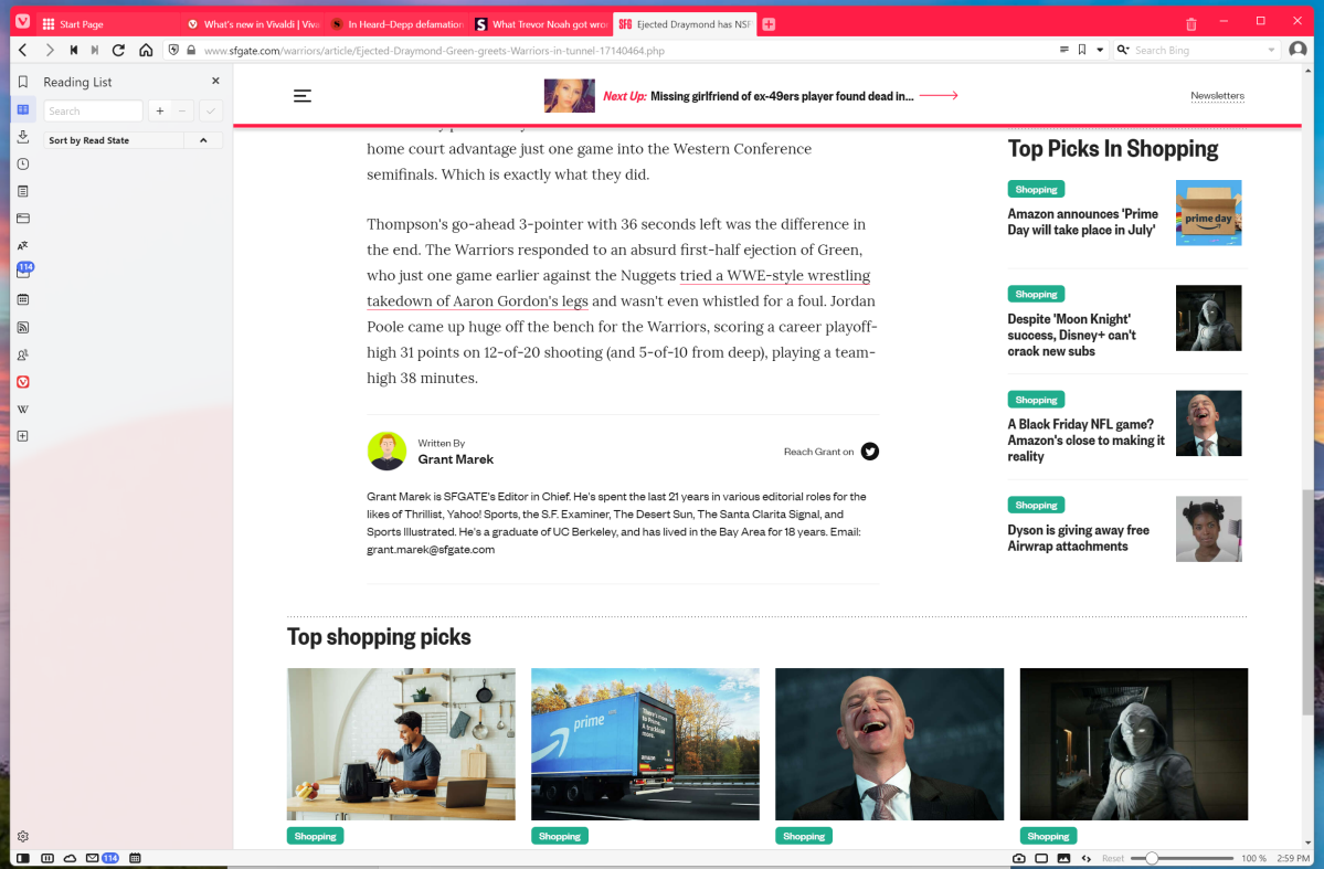
Privacy isn’t what you probably think of when downloading Vivaldi, but you’ll probably be surprised how well it works straight away. You know that Google Chrome and Microsoft Edge view ads as a revenue source, because everything’s allowed by default without an ad blocker plugin. With Vivaldi, ads and inline video are blocked by default — no plugins or add-ons required. The result is a very slick, seamless experience that seems to intelligently block the ads you don’t want to see, while leaving other content intact. Vivaldi tamed the most cluttered, media-heavy sites I visit like ESPN.com or SFGate.com without fail or flaw.
Vivaldi is built upon the Chromium open-source rendering engine that Google Chrome builds upon, which means that you can use Google plugins from the Chrome Web Store. Vivaldi does not collect user data, however.
Mark Hachman / IDG
Mark Hachman / IDG
Mark Hachman / IDG
Interestingly, Vivaldi also includes a “Reader View,” a legacy control that appears on other browsers — the little “text” icon that appears to the right of the URL bar. “Reader View” typically strips down an article on the Web to a plain background, minimal art and navigation elements, and absolutely no ads. With Vivaldi, there’s little reason to use Reader View, as the default view is simply more effective. In some cases, Reader View added visual cruft as it spelled out certain normally hidden elements within the page.
With Vivaldi, you’ll notice a difference in your browsing experience right out of the box.
Vivaldi’s selling point: The side panel
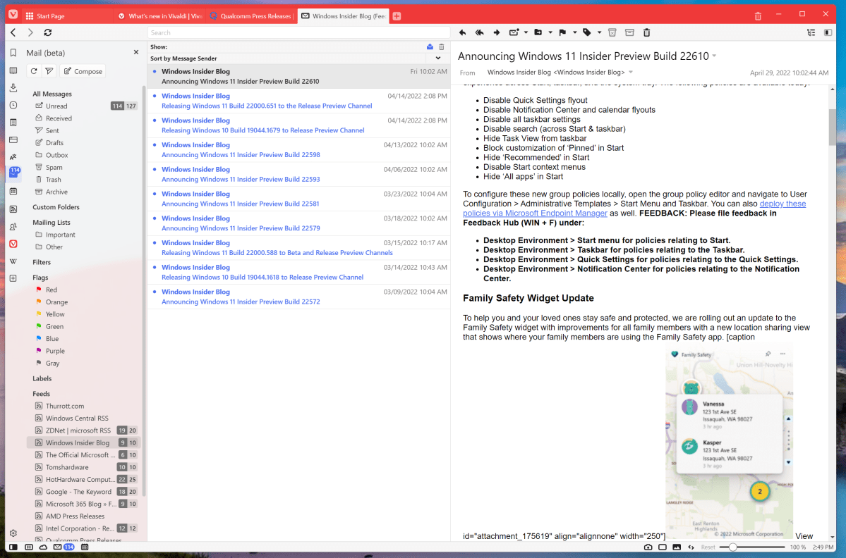
Vivaldi smartly realizes that most larger monitors incorporate a ton of additional white space that goes unused. Vivaldi cuts into this space to add a narrow column of icons that link to a number of utility functions, from RSS feeds to even mail and a nicely organized calendar function. A tiny toggle at the bottom right-hand-corner hides the panel entirely; otherwise you can click on one of the icons — bookmarks, for example — and the panel will slide out to reveal the full function. Figuring out what all the icons stand for and where they live is probably the most unfriendly part of Vivaldi, as it feels a bit like poking around the instrument panel on an unfamiliar car.
Not all of the panel options are particularly novel. There’s a “Reading List” for articles you want to save and dive into later, along with the standard Downloads and bookmarks, called Bookmarks. Unfortunately, I’ve exported my bookmarks enough times that they’re a bit of a mess, though dragging and dropping them into either the Vivaldi Bookmarks folder or to the Favorites bar along the top is pretty easy.
Mark Hachman / IDG
Mark Hachman / IDG
Mark Hachman / IDG
Certain functions might not be that useful, either such as a built-in Google Translate widget. (Vivaldi, like most other browsers, will auto-translate a page in a foreign language.) A dedicated Wikipedia panel didn’t feel particularly useful to me, though you may feel differently.
Personally, my favorite of all of the options is the built-in Feeds panel, which allows you to import RSS feeds and quickly scan what various web sites have published. Sure, that’s a legacy function for reporters like me who need to keep, er, tabs on a variety of websites, but RSS typically requires a standalone service or app. About the only thing I don’t like about it is that while you can drag and drop Bookmarks any place you’d like, you can’t rearrange the RSS feeds for whatever reason.
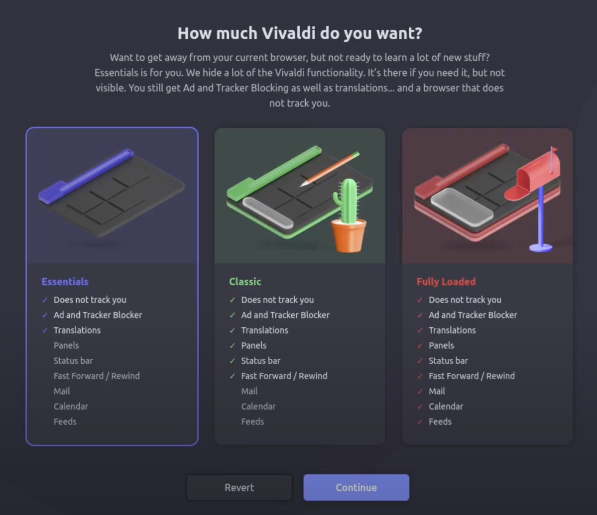
If all of this sounds like too much hassle, you can turn it off. Part of the Vivaldi setup process is deciding “how much Vivaldi” you want to begin with.
Vivaldi
Vivaldi
Vivaldi
Tabs, tabs, tabs
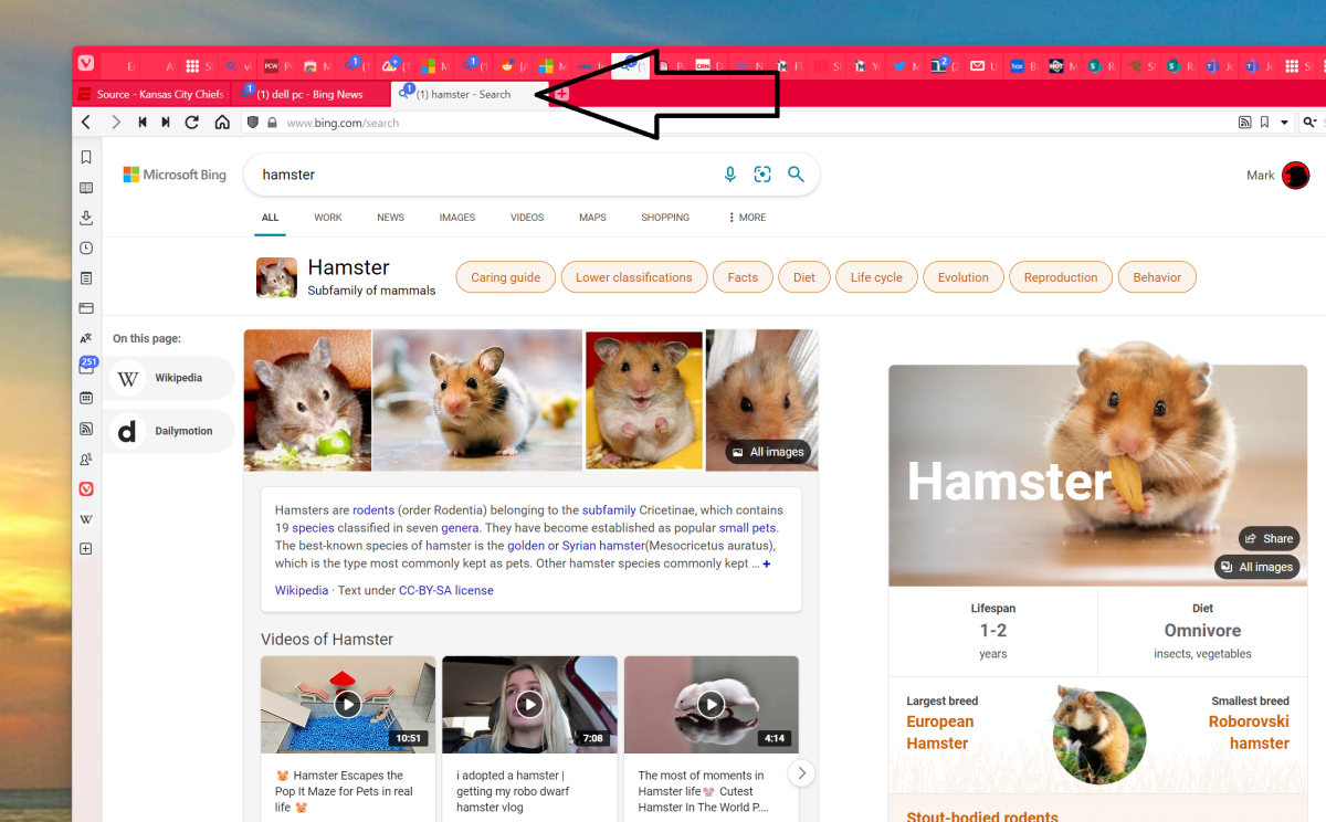
Speaking of tabs, tabs management is Vivaldi’s bread and butter. There are really almost too many options, even for power users! Not only does a Vivaldi user have the option of placing their tabs along the left or right side as well as the top and bottom, but there are different ways of organizing them, too: a traditional layout, but also in tab stacks, “accordion tabs” that sit atop one another and then side out, or just a double row with one on top of the other.
Mark Hachman / IDG
Mark Hachman / IDG
Mark Hachman / IDG
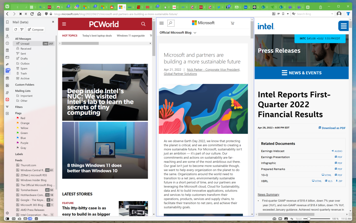
It’s almost ridiculous: you can use your thumbwheel to roll back and forth between tabs, even horizontally; stack the tabs by host, close all tabs to the right or left of the current tab, clone a tab, and so on. You can even Ctrl-click a few tabs, right-click them, and tell Vivaldi to open them in tiled format — that tab will then align the other tabs as tiles, but maintain the formatting of your other tabs. Like we said: ridiculous!
Mark Hachman / IDG
Mark Hachman / IDG
Mark Hachman / IDG
Built-in mail and calendar
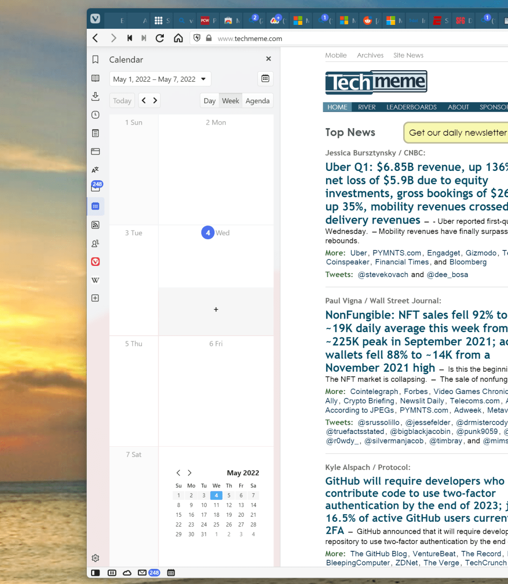
Another unique feature Vivaldi offers is an optional built-in mail reader and calendar, which are also built into the side panel. Vivaldi doesn’t allow you to log into Microsoft 365 or Exchange; it only supports POP3 and IMAP, meaning that it’s a better choice for personal email rather than business contacts. That’s fine by me. In any event, Vivaldi’s RSS feed reader filters through the mail client, so I’ve been just peachy keeping my “real” email on Windows 11’s Mail app and using the Vivaldi mail as a dedicated feed reader.
I feel a little guilty about that decision, though, since I like the Vivaldi calendar. Organizing a calendar in a vertical column, as the Vivaldi app does, really lends itself to a quick, scannable overview of your day — less so, though, when you you view a week or month. There, you can pop out your monthly calendar inside a dedicated tab.
Mark Hachman / IDG
Mark Hachman / IDG
Mark Hachman / IDG
Speed Dial
Unlike Google or Microsoft, Vivaldi doesn’t encourage you to look at its licensed content on its new-tab pages, as Chrome or Edge so. Instead, opening a new tab opens Speed Dial, a bunch of large icon shortcuts to popular sites. Naturally, you can add your own.
You might dismiss this as a bit simplistic, but fishing out a bookmark can take some time. Being able to configure a new tab page with convenient bookmarks is a handy feature, even if something like it can be found on other browsers.
Bottom nav bar controls
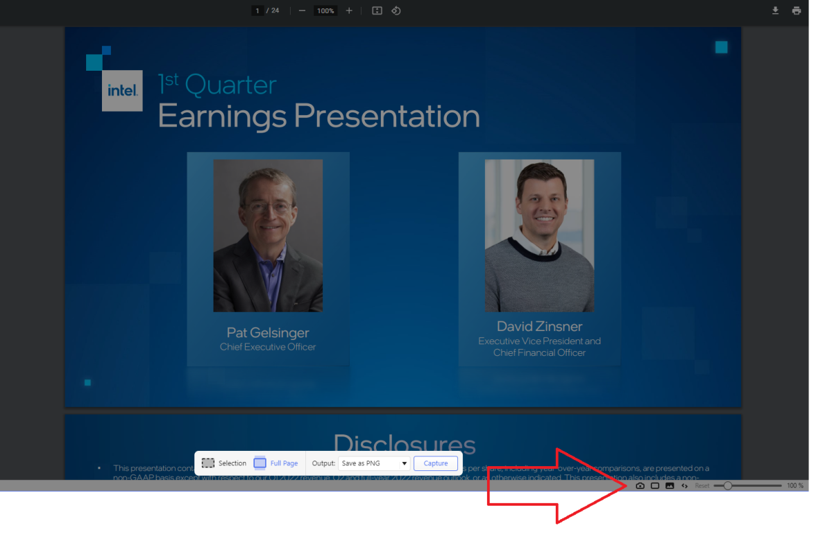
Vivaldi also includes a small set of shortcut icons at the bottom of the screen (if you’ve configured your tabs to appear at the top.) I find these extremely handy. Not only are they appropriately sized for my 4K monitor, they’re just plain useful. There’s a slider to zoom in and out, a quick button to take a snapshot of the page, and controls to turn the current page into a tile, too. I also like the small “trashcan” icon in the top right-hand corner, too: if you’ve accidentally closed a tab, you can click the trashcan to bring it back.
Mark Hachman / IDG
Mark Hachman / IDG
Mark Hachman / IDG
Like virtually every other feature in this list, there’s no obligation to use these. And there are even more, hidden within the Settings menu, that I don’t use: mouse gestures, keyboard shortcuts, and more. There are even “command chains,” or in-browser macros that you can use to execute multiple tasks all in one fell swoop. Those are for the real power users.
If you’re dead set on customizing your browser experience, Vivaldi might be the browser for you. Take a few seconds and find out!
Author: Mark Hachman, Senior Editor

As PCWorld’s senior editor, Mark focuses on Microsoft news and chip technology, among other beats. He has formerly written for PCMag, BYTE, Slashdot, eWEEK, and ReadWrite.
Recent stories by Mark Hachman:
Comcast’s new NOW prepaid Internet looks surprisingly compellingUdio’s AI music is my new obsessionBroadband ‘nutrition labels’ kick in, revealing hidden fees for ISPs


